Partners
Company: AREX· Role: UX Lead · Date: 2021
- B2B
- SaaS
- Fintech
- UX Research
- Prototyping
- Design System
AREX, was a competitive data-driven Fintech start-up aiming to bridge capital market liquidity and SME cashflow needs.
The Challenge
The Partners portal was an application designed to leverage client's data and enable partners to look out of their SMEs.
Main objectives
Improve the user experience
Partners must manage their leads and add extra details.
Be competitive in new markets
Current market: Finland
New markets: Spain and UK
Be the pilot for a Design System
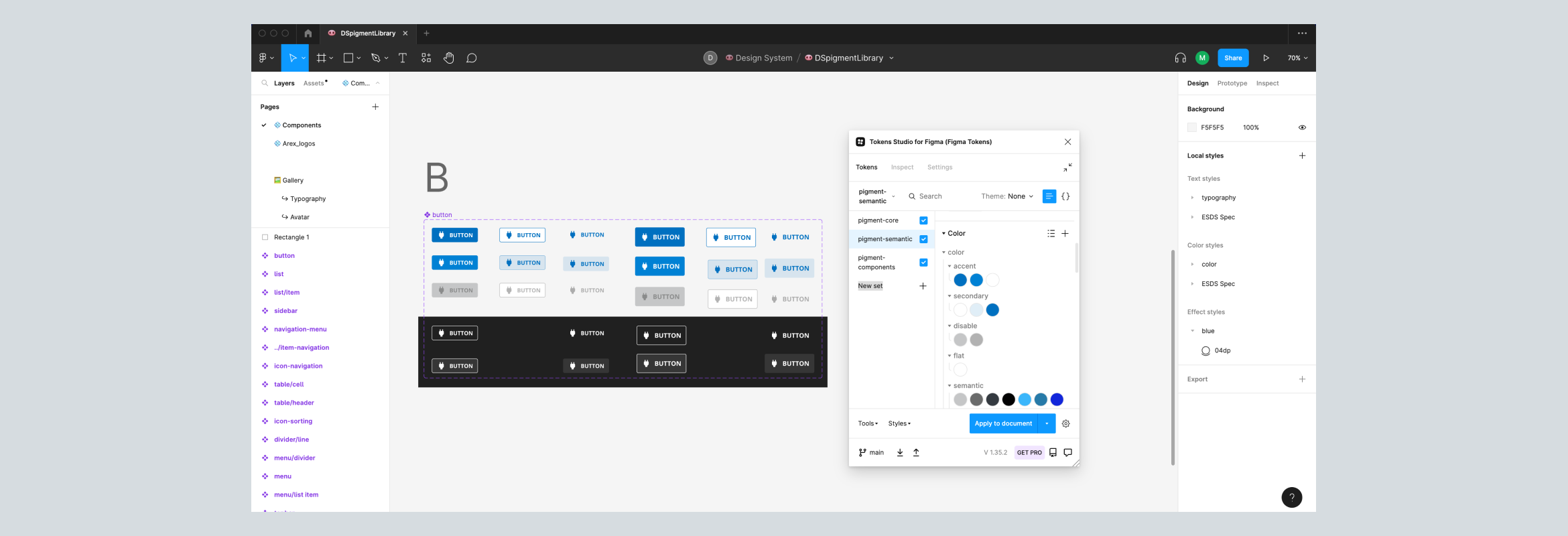
Rebrand and create a UI kit that serves as the foundation of the Design System.
Scope and Business Value
Improving this app was crucial for the company as it aimed to expand into new markets. Operating in Finland, Arex expanded to the UK and Spain, where competitors offered similar, user-friendly services.
The redesign was also important because it will be the first of a suite of apps, leading to the creation of a UI kit and making it easier to build a Design System in the future.
Role responsibilities
Team structure: I was the UX Lead, collaborating with the four squads of the company, managed by the PMs. In this project, I collaborated directly with the Product Manager of "Partners", the Front-End Lead, the Head of Product, and the Head of Marketing (when we had to decide on issues related to product and rebranding.)
Responsibilities: Lead the UX, UI, research, design of components and style guides, and give my user experience acceptance (UXA).
Timeline
One quarter for the Minimum Viable Product and one more quarter to the first iterations.
Outcomes
A lead was created between 33 and 46 seconds.
Creation of a new Design System
Pigment is a new DS for external tools.
Discovery
User research
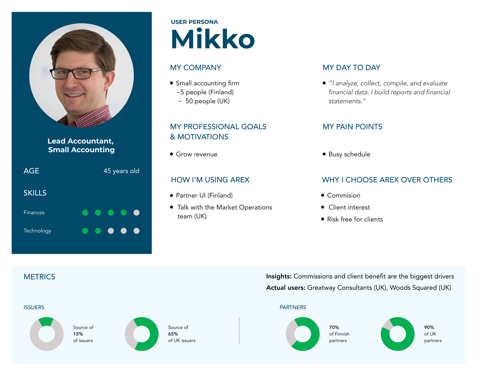
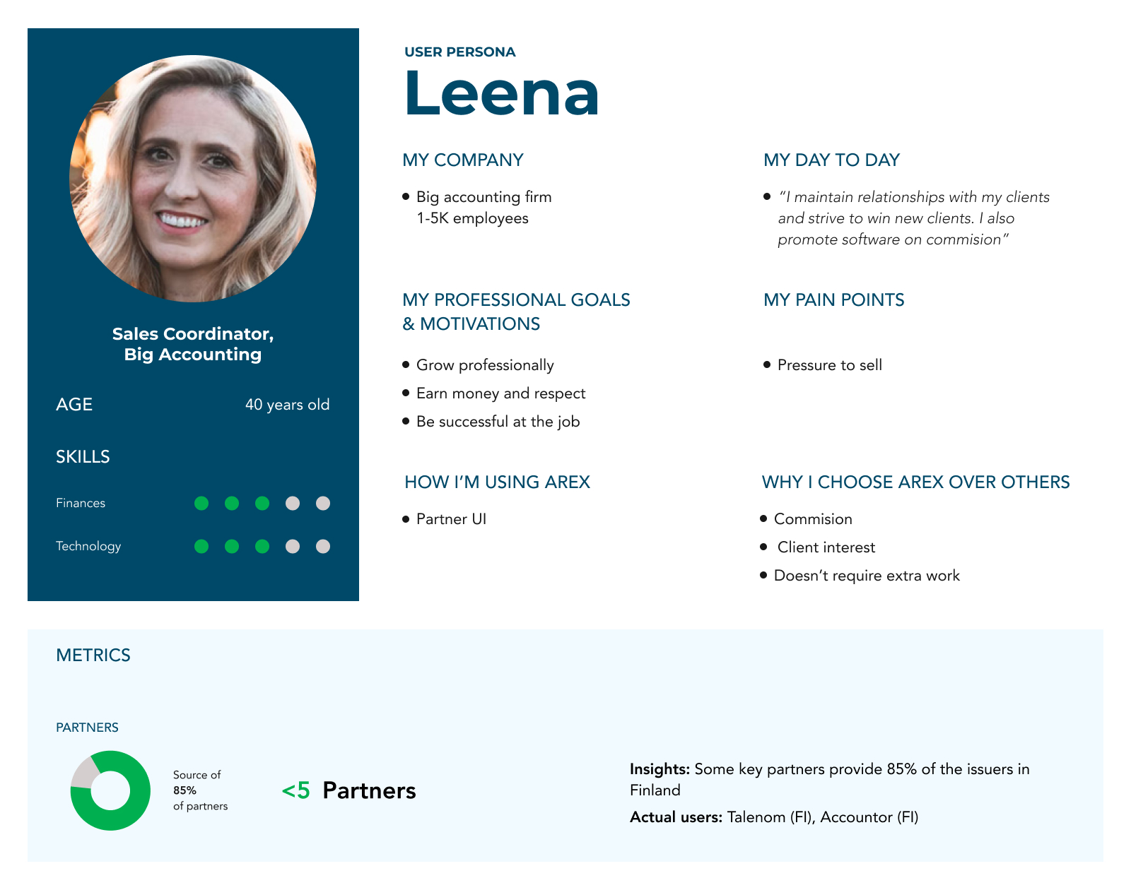
I collaborated with PM, the Sales Manager, and the Client Relationship Manager to create the Partner User Persona based on data from our database, complaints, conversations with partners, and onboarding forms.
Based on the user persona, I could empathize with the users and understand that the users had limited technological skills and were often busy, requiring quick access to information. Therefore, it was essential to design an interface that was simple and easy to use. In Mikko's case, the goal was to create an interface that addressed all his needs, minimizing his reliance on the Operations team for support.
Interviews
I ran some interviews to a group of partners that used the old interface to discover the main user pain points and needs:
- They suggested that the companies could be reordered alphabetically.
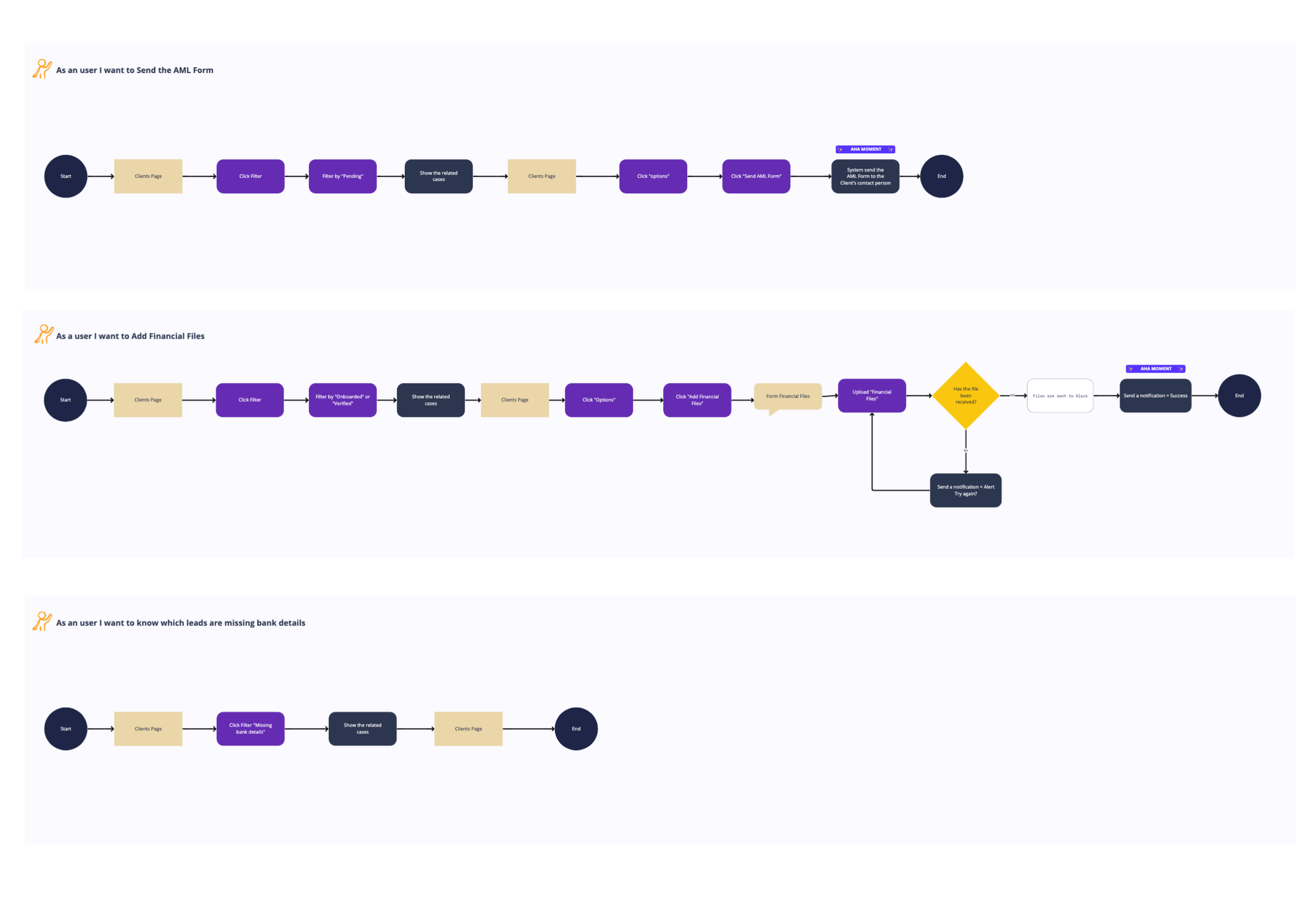
- The users told us that the "Missing bank details" filter was their most frequently used.

Based on this, I not only determined that it was important for the companies column to be sortable alphabetically, but I also added sorting functionality to all columns: dates, registration and client numbers, as well as status. This way, the user would have much more flexibility to review the data and find results more efficiently.
Heuristics
I conducted a heuristic evaluation of the entire old interface and identified significant usability issues, particularly in the forms. There was no prior indication of which fields were required, causing friction for users if they missed filling out a mandatory field. To provide a seamless user experience, we need to anticipate such errors.
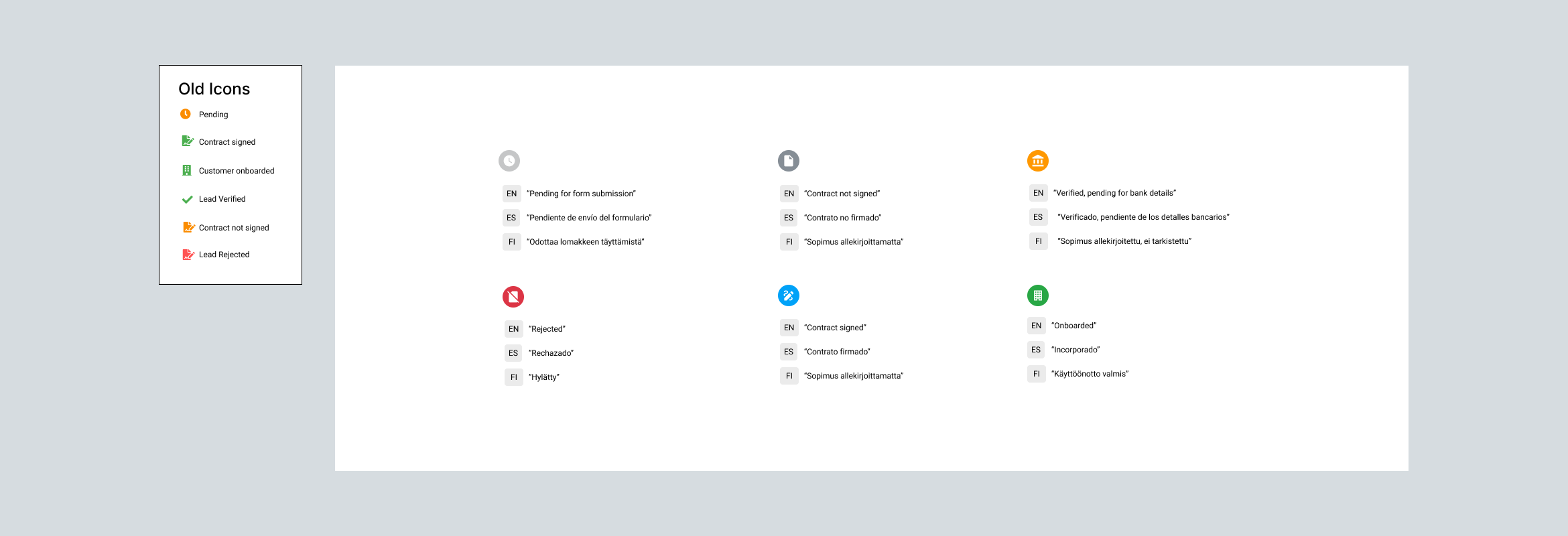
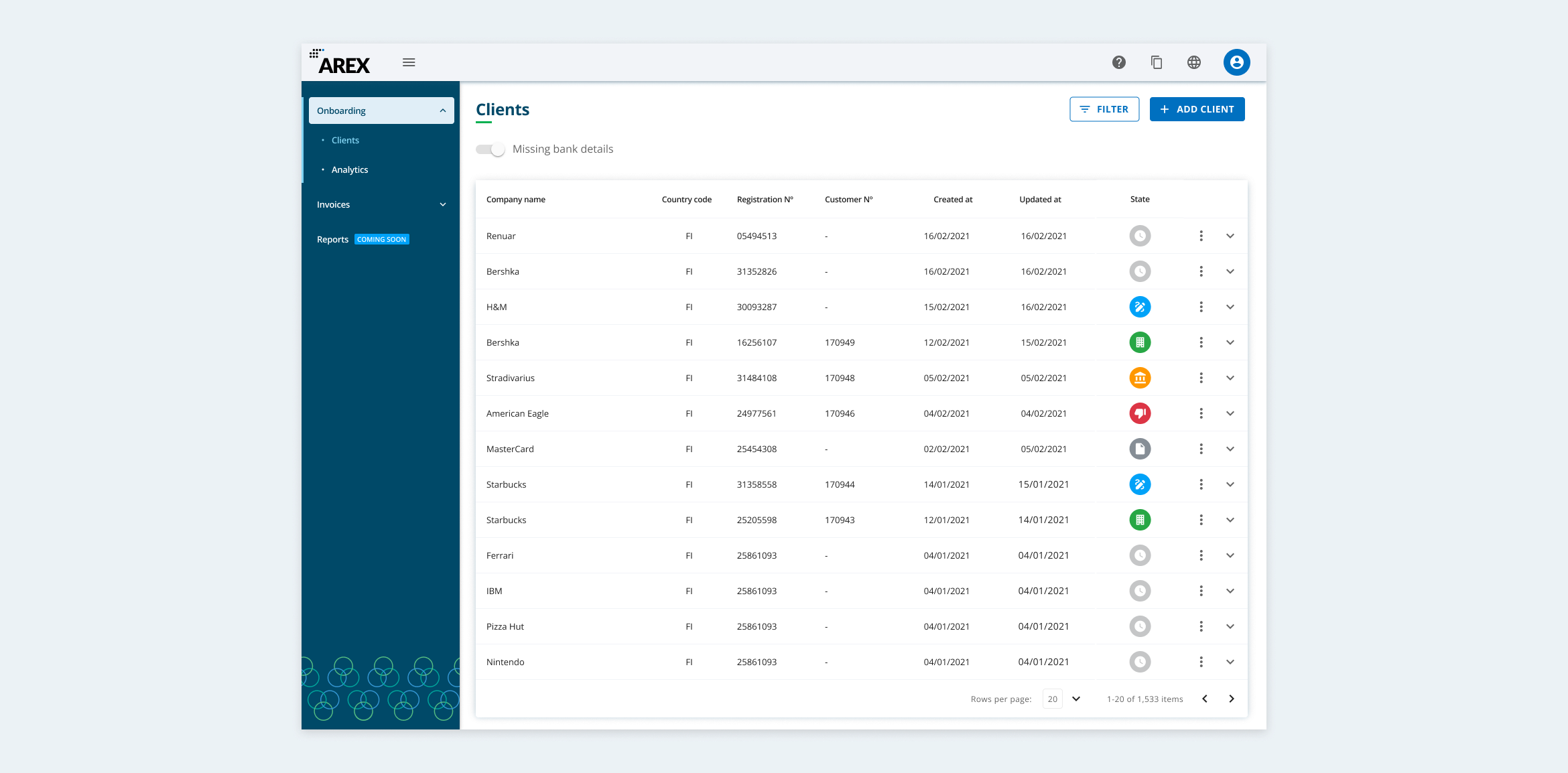
Additionally, the icons representing different statuses were problematic. The same icon was used multiple times, with only color variations to indicate different states. This could easily confuse users and make it difficult for them to recognize and remember each status. A key usability principle is that elements should not be distinguished by color alone.
Definition
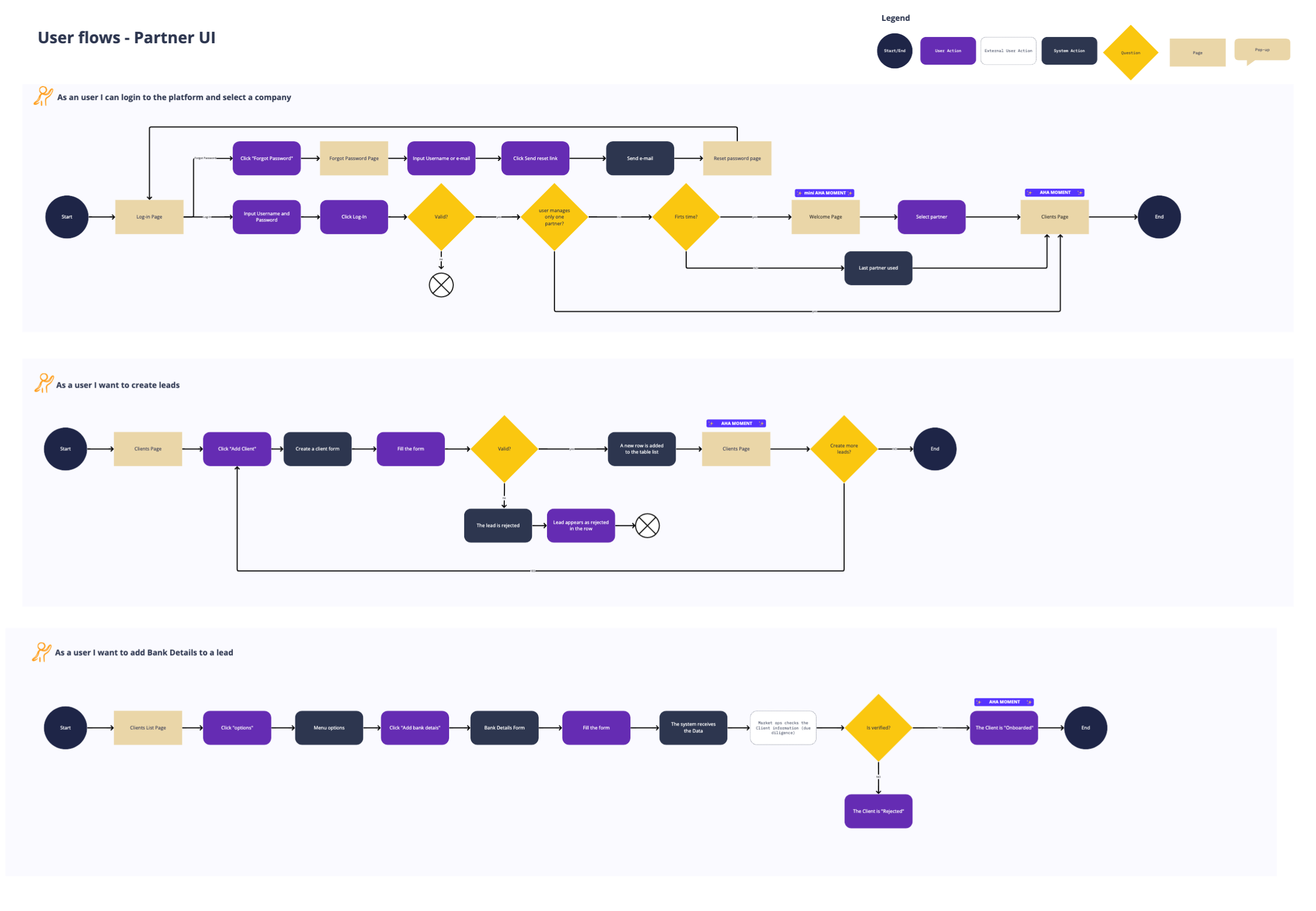
I agreed with the Product Manager that these would be the fundamental user stories for the first iteration of the project:
Creating a new lead
As a partner I want to be able to create a new lead in the system, so that I can manage and track the progress of my leads in an organized manner.
Completing a lead
As a partner I want to be able to update the information of an existing lead, so that I have all the necessary details to complete the data.
Finding a company
As a partner I want to be able to search and filter companies in the system, so that I am looking for based on specific criteria.
Develop
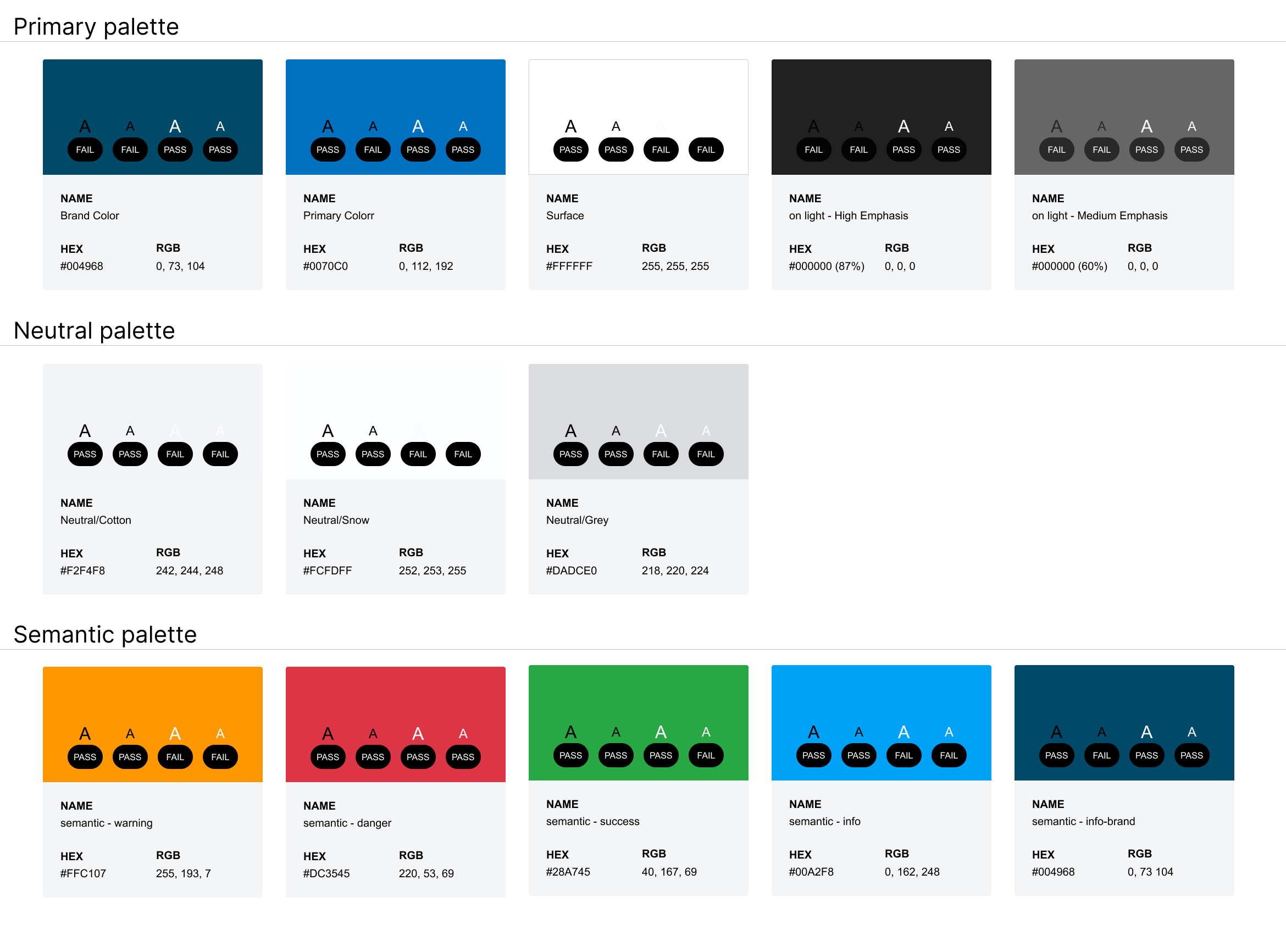
I led a rebrand for this app, establishing a style that would be applied across all external apps after launch. I developed a more vibrant and approachable color palette, ensuring sufficient contrast between text and background. Additionally, I refined the hierarchy of font styles. All components were designed in Figma, creating a UI kit that would serve as the foundation for the design system.
Design system
The Front-end Lead and I decided to build our components using Vue.js, specifically with the Quasar framework. This framework is based on Material Design and its components are easily customizable (CSS) and extendable (JS).
The Design System was internally called "Pigment" and the idea was to scale all the company's products.
Forms
For the forms, we wanted to avoid friction for the user, so we showed in advance which fields were mandatory.
Usability testing
We (the Product Manager and I) ran a usability test with some users to validate all assumptions.
In this case, for the English-speaking participants, I was the facilitator and we recorded the sessions. Together with the PMs I acted as observers. For the Finnish-speaking participants, I trained the Finnish Product Manager to be able to conduct the sessions as a facilitator and then we translated the observations together. Obviously, it was my job to create the scenarios and define the success criteria for each task.
It was a success. I used a high-fidelity Figma prototype. Thanks to this test, we got a new pain from users, which we included in our proposal as an iteration. Our users told us that it would be useful for them to have insight into why a lead was rejected.
So we decided to incorporate this data, a lead could be rejected for various reasons and we were able to show them.

Deliver
The tool we used for the hand-off was Figma. I crafted a style guide and a UI KIT with styles and components. Components based on our framework (Quasar, Vue.JS).
I provided the engineers with all the mockups and prototypes they needed. They used Figma's Dev Mode. (I gave the team a workshop on how to use Figma Dev Mode.)
QA
Because the company didn't have a QA team, the Front-End Team, PMs and I organized some sessions called “Test Party” that involved other people in the company to help us test all the features. The Engineering team fixed the bugs.
Launch
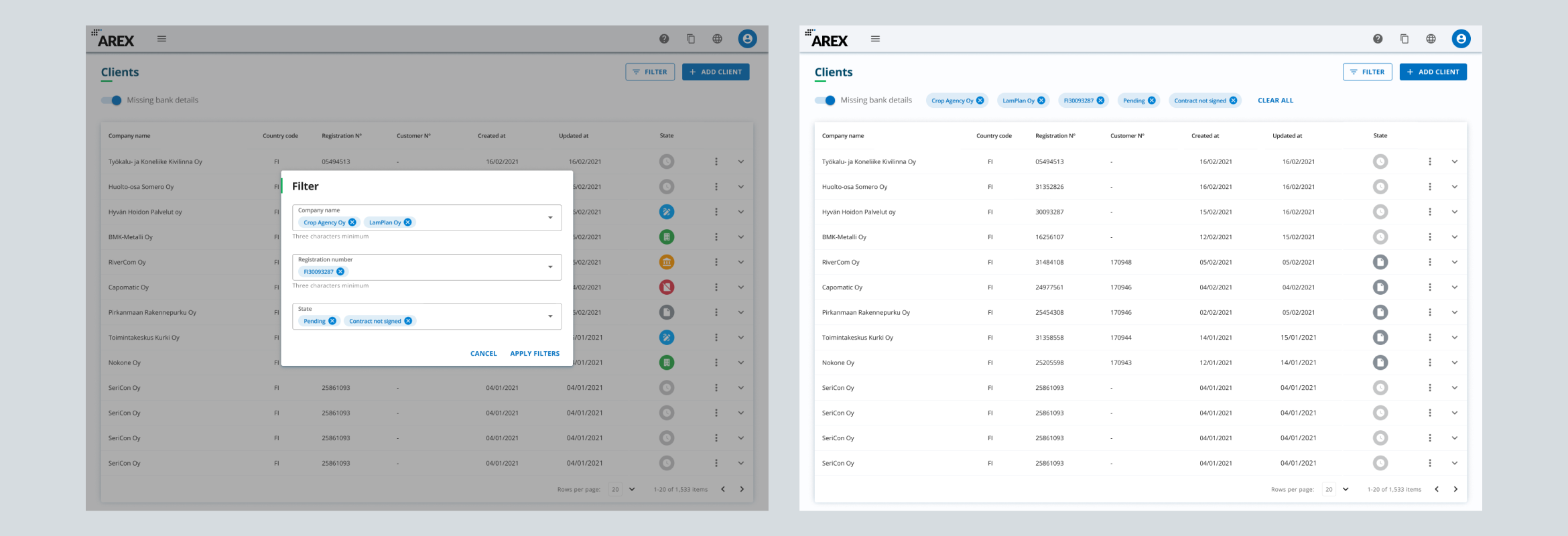
The Partner portal was launched. Below you can see the before and after.
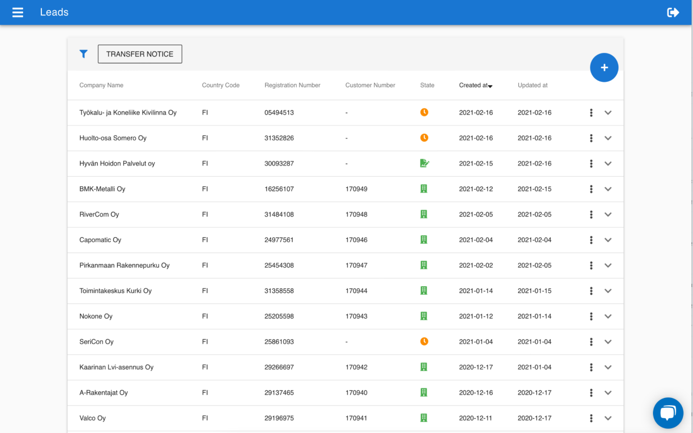
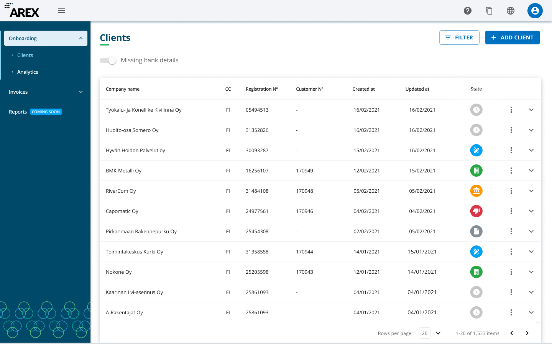
🚀 The Partner portal MVP was published!
Continuous Research
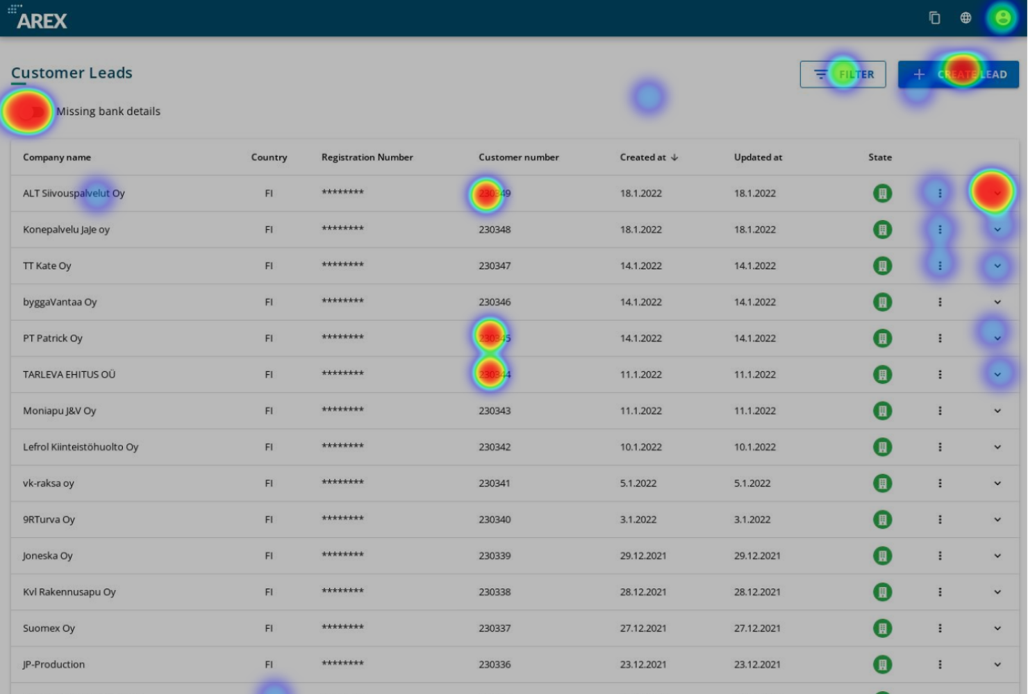
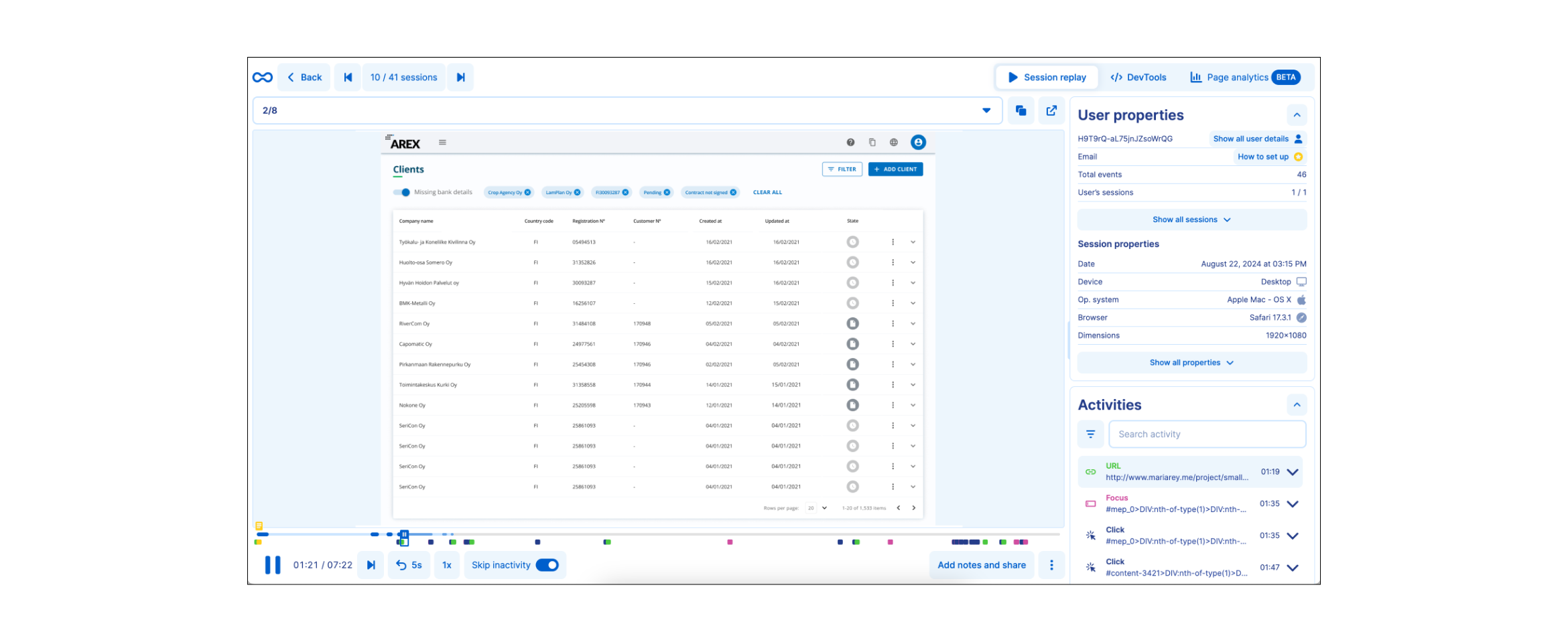
I defined the tooling for Research because the company didn’t have anything yet. I chose Smartlook to validate all the ideas and assumptions for this project and learning more about the user's needs and pains (the budget was small). With the user session recordings, funnels, and heatmaps we could observe our users' behavior.
I settled on some goals to be validated:
- General understanding of the interface: identify the icons, main CTAs, and filters.
- Success criteria: if the user can fill and submit the Create form.
- Success criteria: if the user can find a company using the Filter form.
- Success criteria: if a user can upload Bank Details to a lead.
- I wanted to validate how often the users applied the “Quick filters”.
- Find new insights.
Results and Metrics
A lead was created between 33 and 46 seconds.
I observed in the research that the users had a general understanding of the interface:
- The top-bar icons and the main CTAs (Filter & Create a Lead) were perfectly understandable.
- The new icons, for states, were understood by the users, they initially consulted the tooltips and later they learned their meaning.
- Users identified the three-dot icon as a menu trigger.
- Users could easily open the table by clicking the arrow.
- The quick filter “missing bank details” was used a lot. And users could add bank details effectively.
- The user filled out the "Create Leads" form very quickly: a lead was created between 46 seconds and 33 seconds.
New insights:
I observed friction in the user, they were not sure that the lead had changed status: The user added the Bank Details to a pending lead. The system took some time to refresh the lead to the "Onboarding" status. So users invented a workaround, they touched any interface filter to trigger the refresh. So, we added here a loading.
The Country code selection of the Phone field was a field that was a bit time-consuming for the users. They scrolled down the list to find their country (Finland, UK, and Spain). They didn't enter the first letter of his country, they preferred to scroll. So, I redesigned the component with a list of the most frequent countries first before the A-Z list.
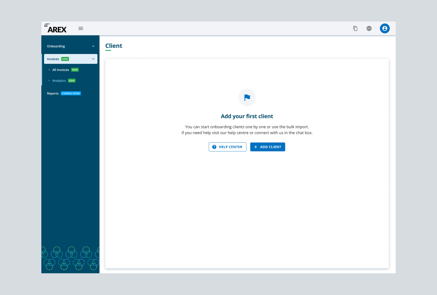
Navigation (new features) and empty state.
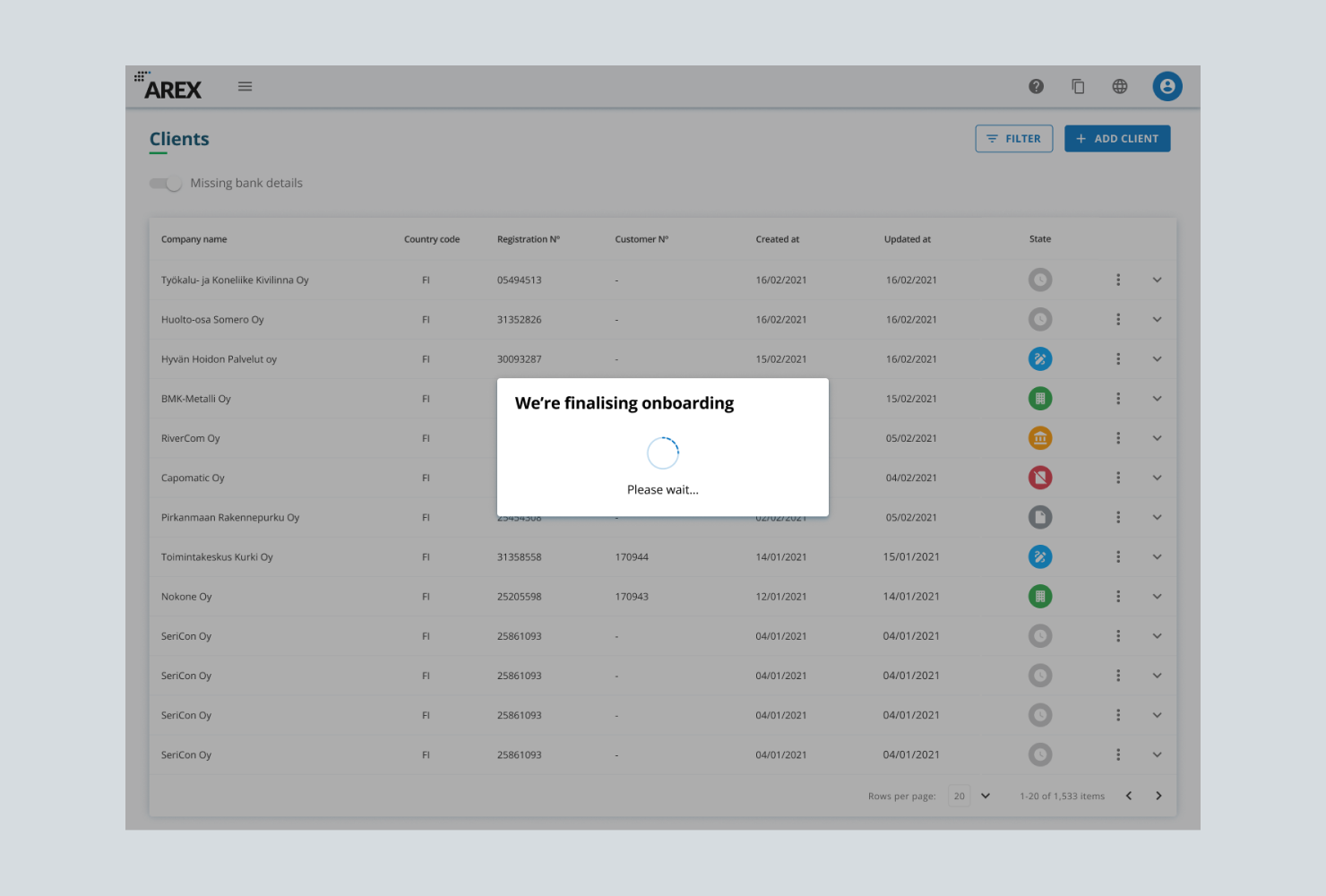
Loading while the company is being onboarded.
Selected work

People & TimeSaaS - B2B

Partner PortalFintech - SaaS - B2B
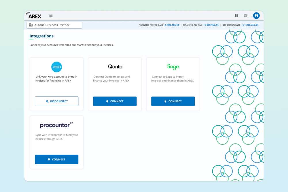
Invoice finance integrationFintech - SaaS - B2B
Rebuilding the Back Office for ScaleFintech - SaaS - B2B

A small vehicle journey MaaS - SaaS - B2B - Mobile

Discovery Home - Promofarma Marketplace - B2C - Mobile
