Discovery Home
Custom home for the user
Company: Promofarma· Role: UX Designer · Date: 2017
- B2C
- Marketplace
- UX
- Web app
- Mobile app - iOS & Android
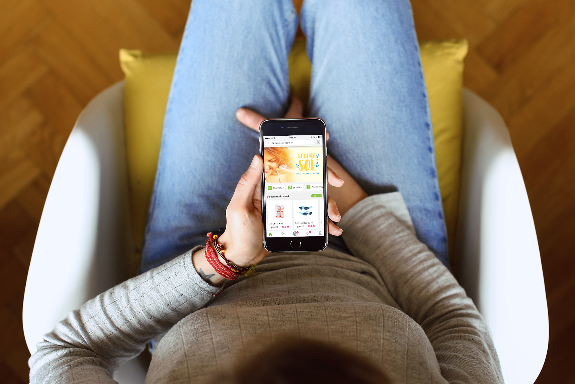
PromoFarma is an e-commerce marketplace that connects consumers directly with pharmacies and providers of health, beauty, and personal care products.
The Role
From 2016 to 2017 I was the UX-UI at Promofarma. I worked closely with product owners, and developers under a Scrum methodology to create an end-to-end experience for the 24-hour delivery flow of Promofarma's marketplace. I redesigned the payment flows, product details, and registration for the web and mobile apps (iOS and Android). I improved the search process for the mobile apps, created the categories page, and designed the flow for adding products to the favorites list.
This effort led the company to win the following awards:
- Best Mobile e-Commerce Strategy 2017 - E-COMMERCE AWARDS 2017
- Best Digital Company Spain 2017 - E-COMMERCE AWARDS 2017
The Challenge
The data showed that the most visited section of the application was the home page, however, users did not make any purchases of the products offered on it.
We saw the need to present the Promofarma home page as a personalized section for each user, where they can find new products of interest.
The Analysis
The home offered the most important discounts, the most interesting selection of products for the company, and the latest news.
When a user was not registered we did not have much information about them and their tastes and needs and we could not customize a proposal for them. We offered a generic proposal.
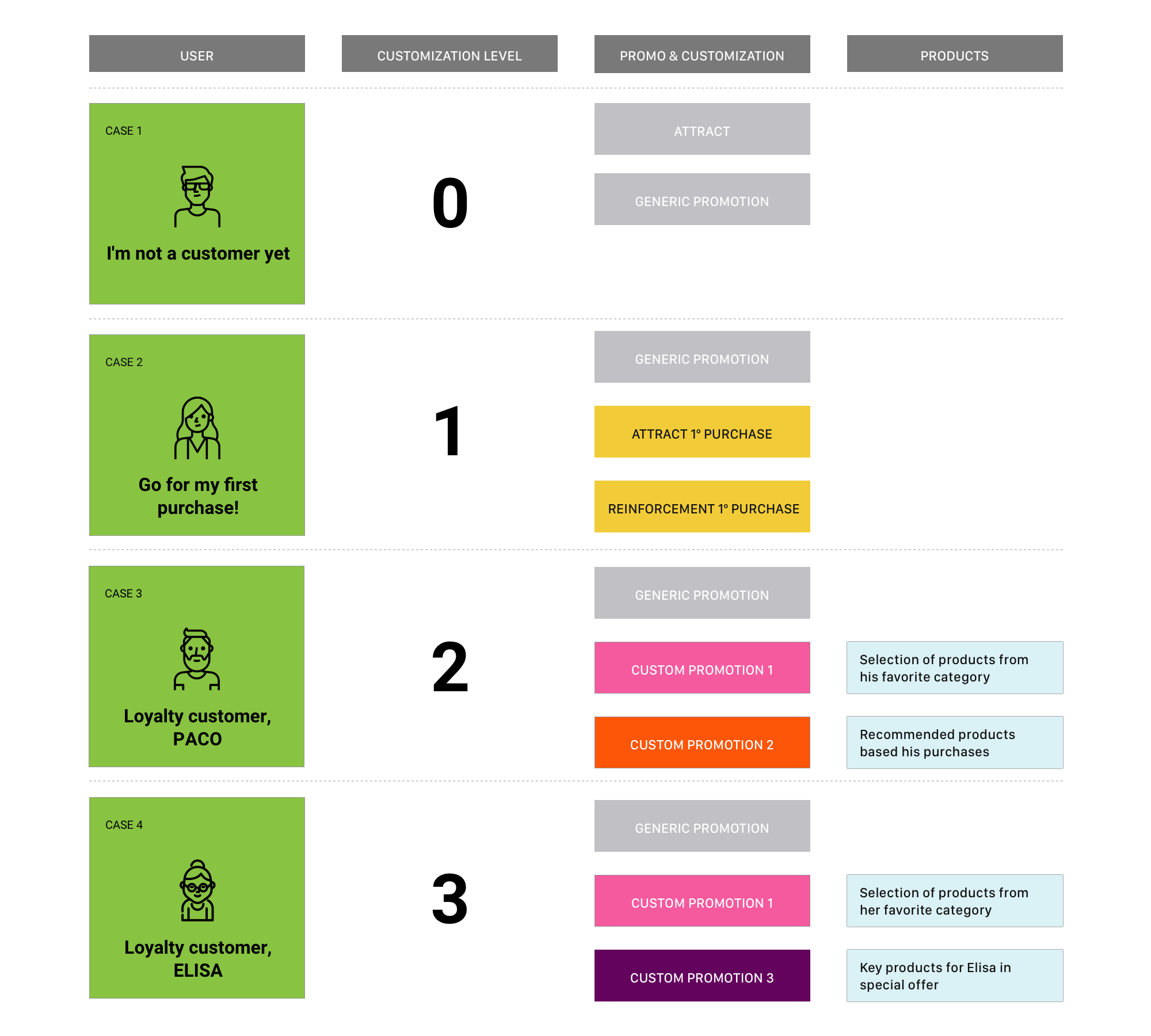
But we had information about users who had registered and already made a purchase. We could determine for them a better level of customization. Using this information we coud propose «customized» homes, each user got new product proposals and offers directed to them in the home of the app.
This was the initial approach we made to different degrees of customization:
The Solution
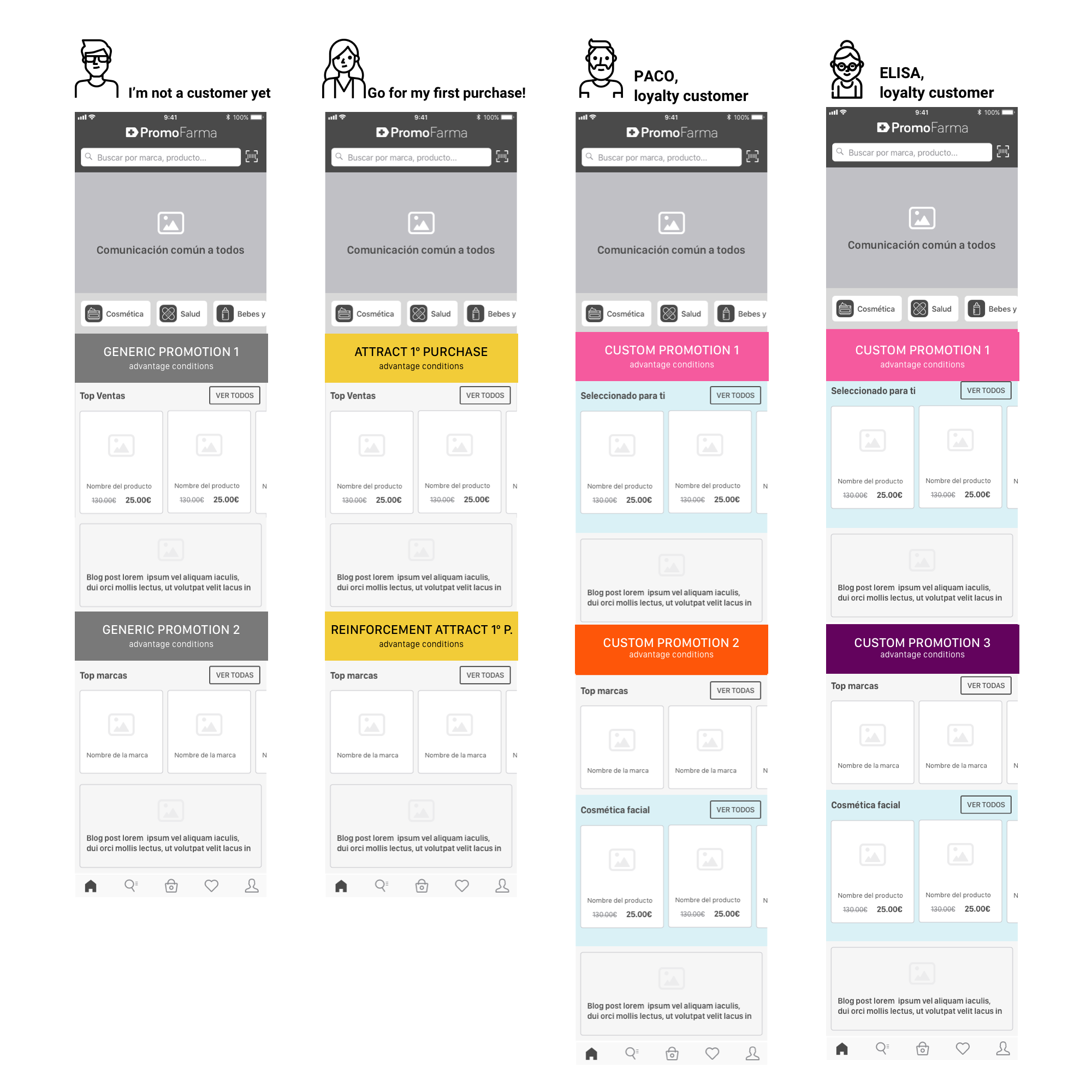
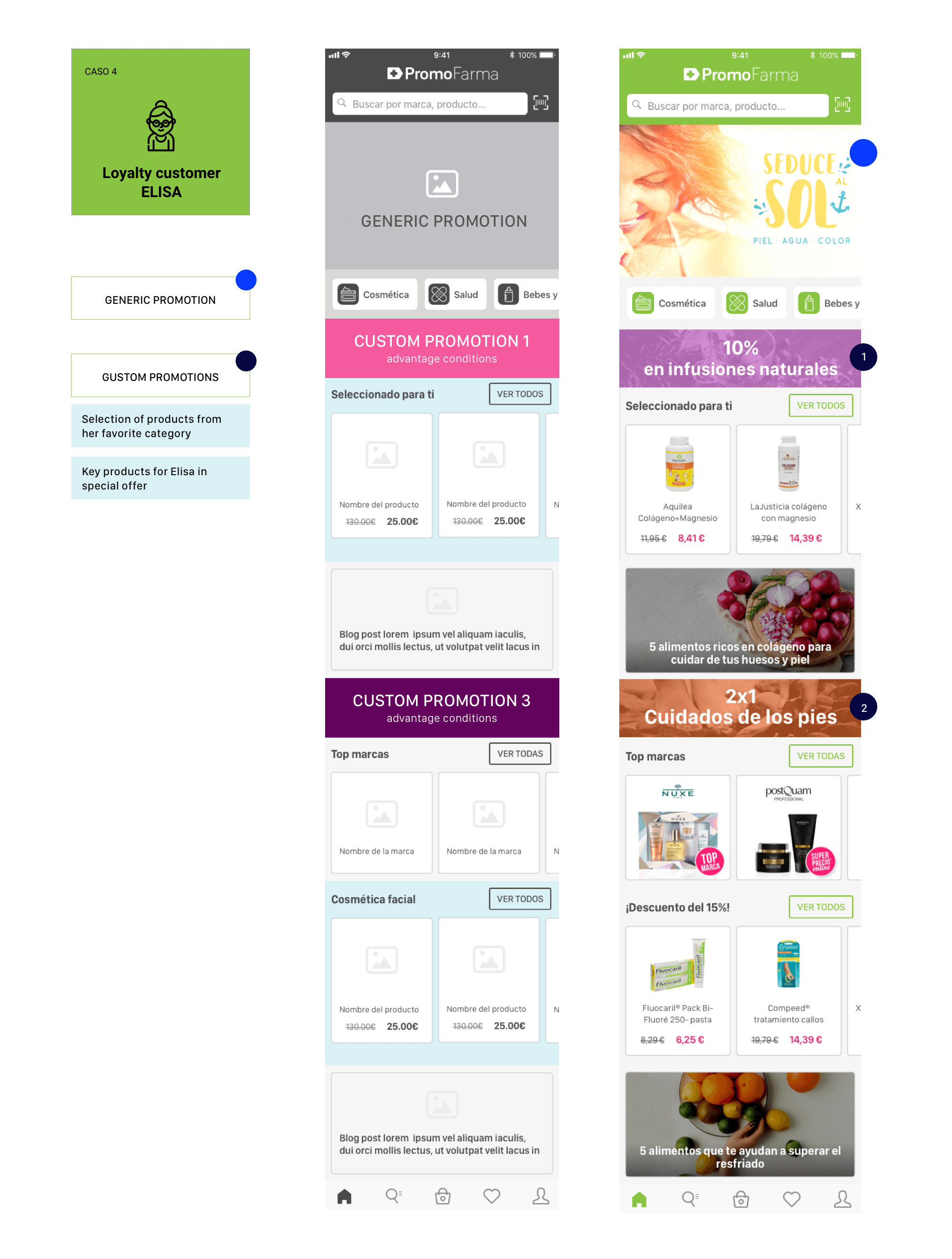
The home was made of product blocks related to the user and, others grouped by subjects, combined with promotions also segmented by user types.
The customization possibilities in content and promotions were endless. This strategy would be used with the intention of making the user stay longer in the app, so they can buy more products of interest and feels like an important customer (that is, a loyal customer).
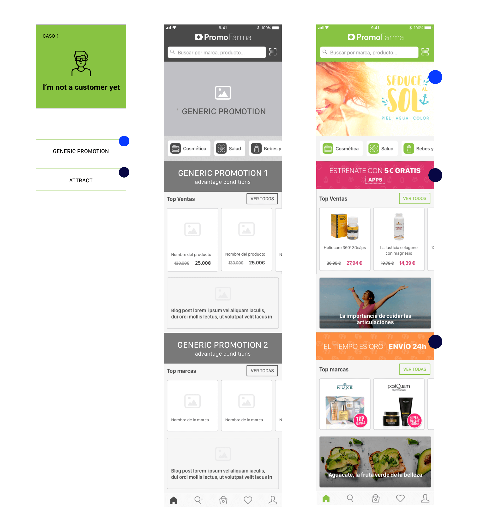
The contents of the user interface of «Case 1 – Not Registered» compared to «Case 4- Loyal Client, Elisa» are totally different. In «Case 1» there is generic content but in «Elisa’s Case (4)», the home is totally adjusted to her tastes and interests. We can show her products more tailored to her tastes and also be able to offer her discounts that are interesting and profitable for the company.
Selected work
Partner PortalFintech - SaaS - B2B

Embedded FinanceFintech - SaaS - B2B

Invoice finance integrationFintech - SaaS - B2B
A small vehicle journey MaaS - SaaS - B2B

Safe Mobility in the Pandemic MaaS - SaaS - B2B

Discovery Home - Promofarma Marketplace - B2C - Promofarma